Even the highest-quality wardrobe can look chaotic if the colors in it are not well combined. That is why stylists pay so much attention to how color combinations work.
Color is not just a decorative element. It defines the harmony of an outfit, influences how the silhouette is perceived, creates contrast or, on the contrary, a soft monochrome.
The good news is that most stylish outfits are based on a few simple rules. It is enough to understand the basic color combination palette, know a few proven schemes, and apply them in everyday life.
In this article, you will find a simple system that will help you quickly create good color combinations without complex theory.
Color combination table in clothing – a quick cheat sheet
If you do not want to think about color combinations every time, the best solution is to have a simple color combination table for clothing at hand.
This is a universal guide that helps you quickly understand:
- which color combinations look harmonious;
- where it is worth creating contrast;
- where monochrome works better.
Such tables are used by stylists when working with capsule wardrobes.
How to use the table
To create a good color combination, it is enough to follow a simple algorithm.
Step 1. Base. Choose a base color. It can be:
- black;
- gray;
- beige;
- brown;
- cream.
This color creates the foundation of the outfit’s harmony.
Step 2. Secondary color. Add a second shade to the base to maintain balance. For example: gray and blue, beige and green, black and graphite.
Step 3. Accent
The third element creates an accent. It can be:
- a bright jacket;
- an accessory;
- footwear.
This element is what gives the outfit its character.
Table 1. Basic color combinations
| Base | Best combinations | Effect | Where to wear | Outfit example |
| Black | white, graphite, olive | restrained | city, work | black pants + white T-shirt + olive jacket |
| Gray | blue, black, burgundy | elegant | office, casual | gray sweater + black pants |
| Beige | white, brown, green | “expensive” look | travel, city | beige coat + white T-shirt |
| Khaki | black, sand | utilitarian | outdoor | khaki pants + black jacket |
| Navy | white, gray | classic | work | navy jacket + light shirt |
| Brown | cream, green | natural | everyday | brown pants + cream sweater |
Such color combinations work easily in everyday wardrobes and help quickly create stylish outfits.
Color palette: the Itten color wheel
To better understand color combinations, designers often use the Itten color wheel. It is a scheme that shows how different shades interact with each other.
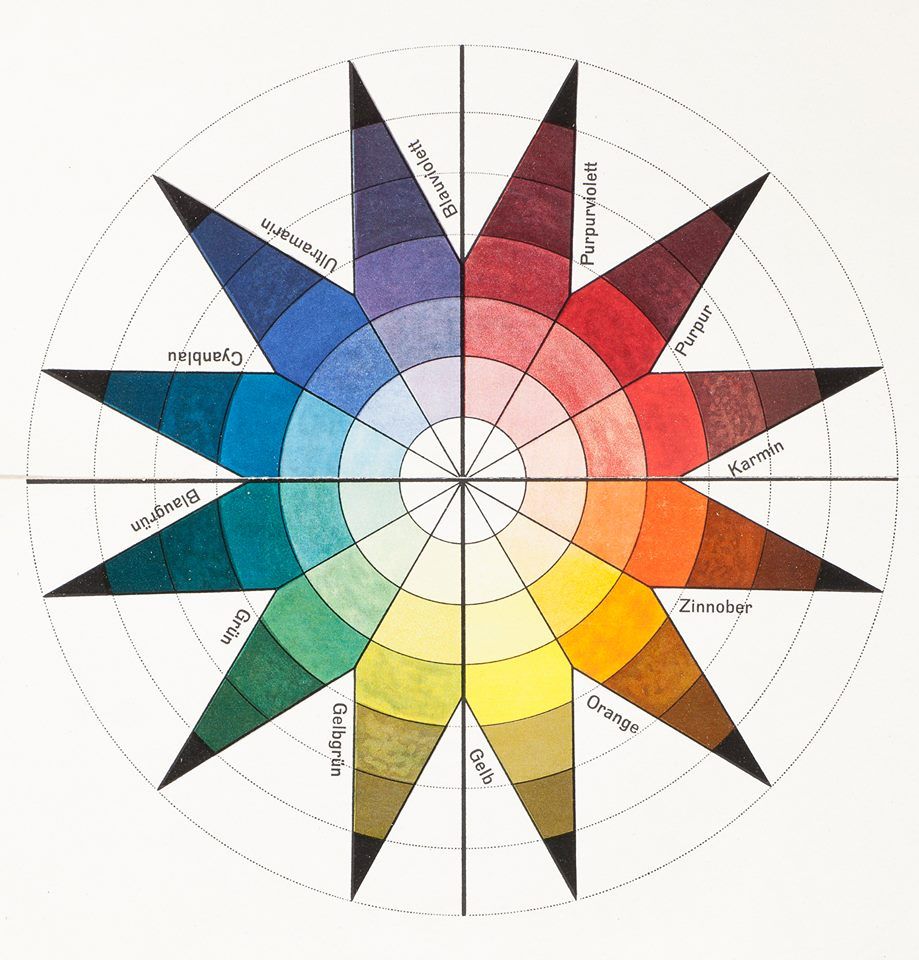
It allows you to create:
- harmonious color combinations;
- strong contrasts;
- smooth monochrome.
Even a basic understanding of this principle greatly simplifies choosing colors in a wardrobe.
Color combination schemes
Three main schemes are most commonly used.
- Monochrome – one color, different shades and saturation.
For example:
- navy;
- blue;
- light blue.
This approach creates calm harmony and works well in minimalism.
- Complementary scheme – two opposite colors on the wheel.
For example:
- blue + orange;
- green + red;
This creates strong contrast.
- Analogous scheme – colors located next to each other.
For example:
- green;
- olive;
- yellow-green.
This combination looks natural and soft.
Color combinations in outfits: practical rules
Color theory is useful, but in practice everything works more simply. Stylists focus on three things:
- color temperature;
- tone;
- saturation.
These create balance in an outfit.
Balance of temperature and contrast
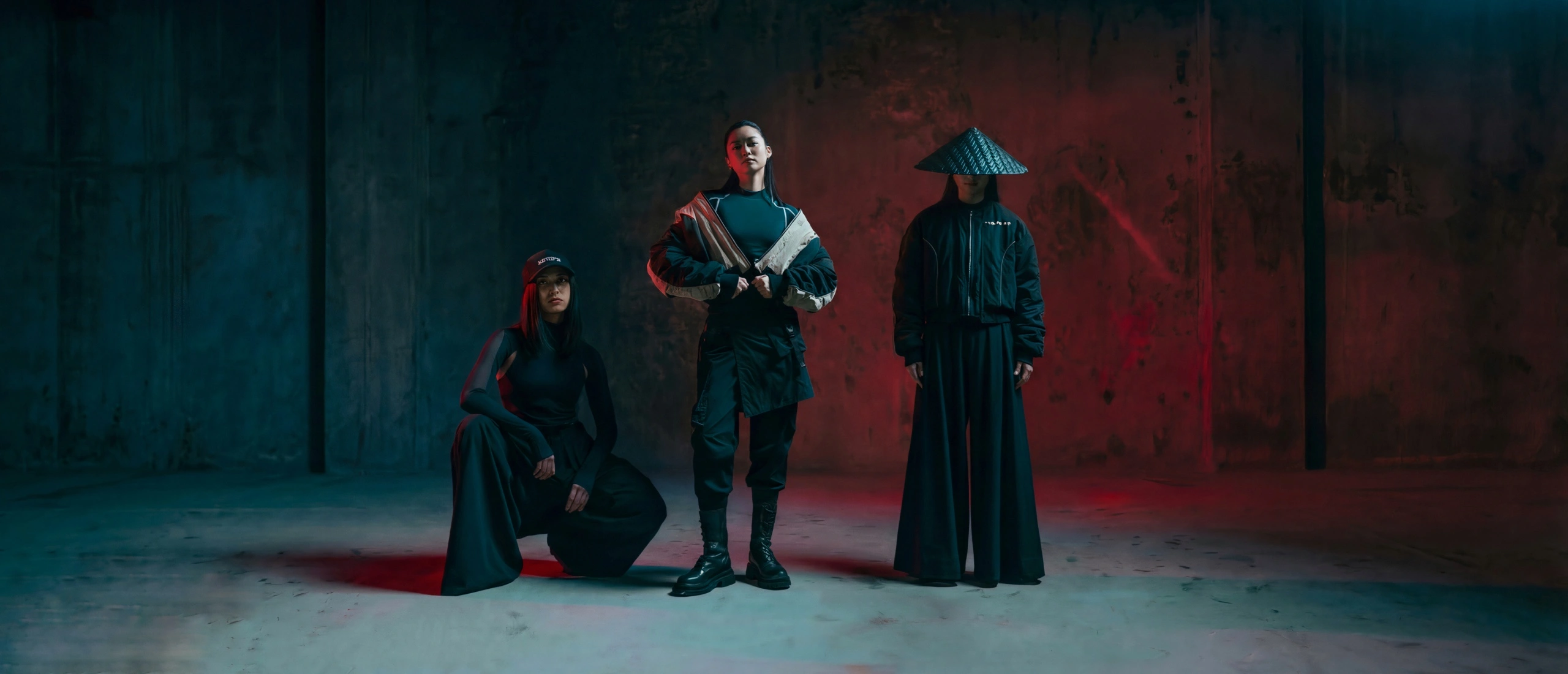
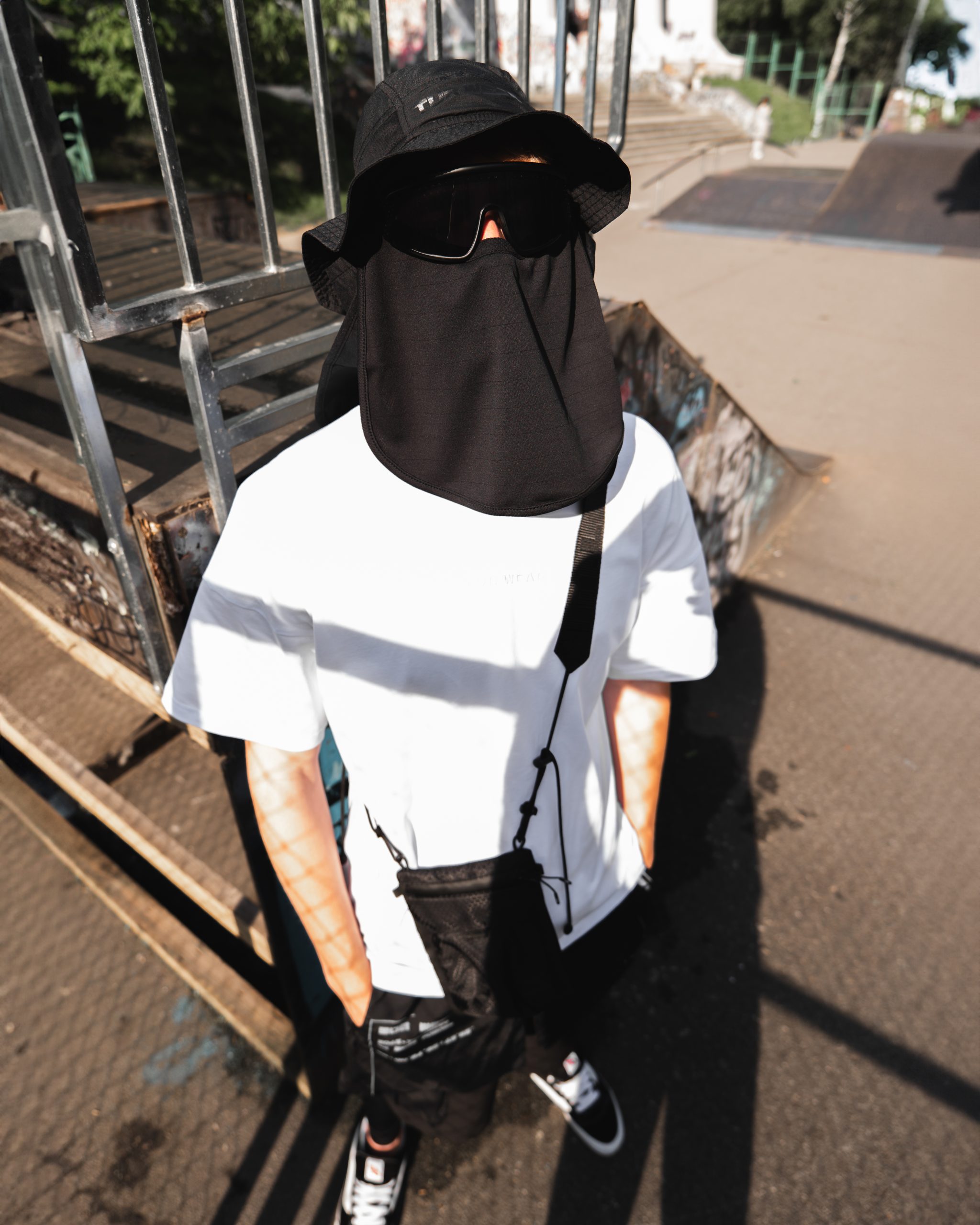
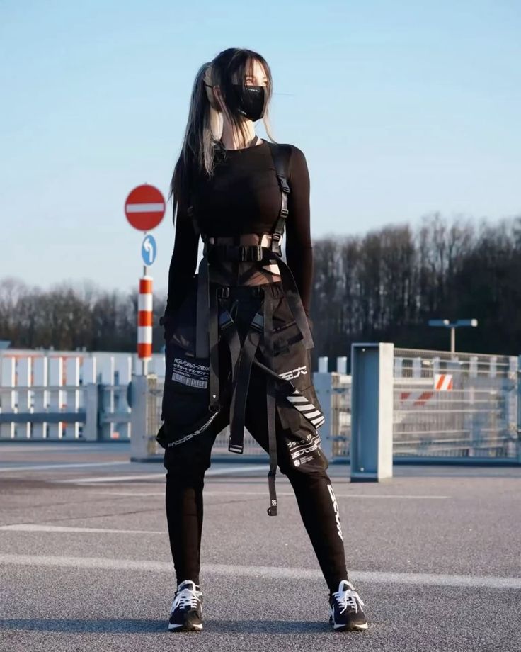
To create good color combinations, it is worth considering three types of contrast. One of the easiest ways to learn is to start with a neutral palette. For example, in TUR Wear collections, a combination of black, graphite, and khaki often appears. This is an ideal base for a modern urban look. A black anorak can be combined with khaki cargo pants and a light T-shirt. This creates natural contrast while maintaining harmony. If you add a bag or cap in a more saturated color, a subtle accent appears that brings the outfit to life. This is how practical color combinations work: a neutral base, moderate contrast, and one thoughtful element that completes the look. Other examples:
- Warm vs cool shade – e.g., warm brown and cool blue.
- Light / dark – adds depth to the outfit.
- Bright / muted – a modern contrast of saturation.
As a result, the right balance of these three parameters allows you to create stylish combinations even using only 2–3 colors.
Good color combinations: where to start
Many people think that a sense of color is an inborn talent. In reality, it is a skill that can be developed. At the beginning, it is best to use ready-made schemes instead of experimenting with complex contrasts.
Safe combinations to start with
If you are just starting, these combinations almost always work:
- gray, white, black (monochrome);
- black, cream, brown;
- navy, beige;
- olive, black;
- beige, white, denim;
- graphite, burgundy;
- green with beige or khaki.
These combinations look natural and easily adapt to different styles.
A palette inspired by nature also works well – for example, green with beige or brown. This creates a calm, modern aesthetic, especially popular in functional style.
What to combine with gray
Gray is one of the most versatile colors in a wardrobe. It is easy to match and works well with most shades.
- gray + white – clean harmony;
- gray + black – stylish monochrome;
- gray + burgundy – elegant contrast;
- gray + blue – classic;
- gray + green – natural palette.
Gray does not limit – it creates possibilities. The key is balance.
What to combine with brown in clothing
Brown has returned to fashion as a warmer alternative to black. It is more natural and works great in a capsule wardrobe.
- brown + cream – soft harmony;
- brown + beige – natural palette;
- brown + blue – deep contrast;
- brown + green – outdoor vibe;
- brown + black – strong effect.
Colors, prints, and textures
When combining colors, prints and textures also matter.
- matte materials soften color;
- glossy materials enhance it;
- large prints increase contrast.
The rule of repeating color in an outfit also works well.
For example:
- green jacket;
- green detail on a T-shirt;
- a bag in the same shade.
This creates cohesion and really works.
Summary
Combining colors is not magic, but a system of simple rules:
- stick to a palette;
- control contrast;
- add an accent;
- maintain balance.
And suddenly even a simple outfit looks well thought out.
And the best part? Over time, you start doing it automatically.